Developer: Sega Publisher: Sega Release: 05/11/95 Genre: Platformer
With its pre-rendered graphics, insane line scrolling and large sprites Clockwork Knight looked like a platformer fan’s dream. The early import reviews seemed to beat that out as well. Once it was released however in reality it turned out to be merely adequate. In a year where Yoshi’s Island and Donkey Kong Country 2 were released, two of the greatest platformers of all time, Clockwork Knight is barely above average in comparison.
At midnight Chelsea the Clockwork fairy wakens the toys of the house with her voice and a merry time is had by all. When a mysterious enemy kidnaps Chelsea both Pepperouchi and his rival Ginger leap into action to save her. It is a bit serendipitous that Clockwork Knight released the same year as Toy Story although both properties approach the same theme in different ways.
Pepper is a toy soldier who uses a keyblade as a weapon (wonder where Square got the idea). The basic jab is pretty weak but will daze enemies, allowing you to pick them up. The keyblade can twist after a thrust to do further damage. It also doubles as a, wait for it, key to open boxes and locks. You will have to adapt to the sloppy controls to enjoy the game ultimately. Pepper is a gangly sprite who can’t quite stop on a dime. His sense of momentum is off and he tends to flail about when you jump. It is manageable but hardly ideal. The loose controls are doubly disappointing as this was the era where the 2d platformer was perfected. To see a new game on fresh hardware struggle with the basics is sad.
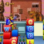
Clockwork Knight takes place entirely in a house with its rooms serving as levels. The game starts in the kid’s playrooms before moving to the kitchen and finally the attic. They use the toy theme to great effect, much like Monster in my Pocket. Everyday objects such as tea cups, toy planes, clocks and pencils suddenly take on a deadly veneer. The game is at its best when it turns man made environment into one big playground. A toy train track is a brief respite from the straight platforming. A sink full of dishes will challenge your ability to control Pepper while a piping hot stove threatens to end your life at any moment.
These moments are fleeting however. Ultimately Clockwork Knight suffers from being boring. It has its moments. Most levels feature more than one path to the exit and plenty of hidden areas. However in most cases you can easily make a bee line to the exit with little resistance. It picks up in the Attic however by then it is too little too late. Clockwork Knight left me wishing there were more to it. More could have been done with its theme and mechanics. The keyblade turning is underused and could have added some much needed depth to what is a by the numbers platformer.
The lacking difficulty does not help either. Clockwork Knight is insanely easy despite the slippery controls. Life restoring gears are abundant and most enemies put up little resistance. Between levels you can bet bottle caps to win extra lives in large numbers pretty easily. Despite the lack of any checkpoints most will breeze through the game until the attic. Only the bosses put up any fight with these encounters being the game’s highlight. And just imagine: the western versions are more challenging than the original! Was the Japanese version for babies?
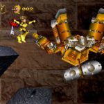
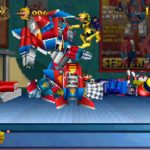
What initially garnered Clockwork Knight so much attention is its visuals. Clockwork Knight uses pre-rendered sprites but to a degree beyond what was capable on 16-bit. The sprites are large and well animated; sometimes a little too well. There is line scrolling on nearly every object lending them a 3d effect. Speaking of 3d, there are polygonal elements in the background that interact with the foreground in cool ways. Aside from that almost all of the game’s bosses are polygonal and pretty impressive for its time.
That last sentence is pretty apt. Around 1995 when pre-rendered graphics became big there were 2 camps. Those in favor of the rendered sprites and those championing hand drawn graphics. Ultimately the pencil prevailed as traditional 2d art is timeless. Clockwork Knight shows its age in many ways. Its backgrounds are low resolution and a bit muddy. The overall color palette is very drab despite its toy theme. While there is a decent bit of FMV it suffers from the terrible compression early in the Saturn’s life. But at least the Latin soundtrack still holds up beautifully.
In Closing
Clockwork Knight is a decent game that ultimately doesn’t make full use of its theme. It is perfectly serviceable however it is only slightly above average in its genre. It is a cool early showcase for the Saturn but not a game you will end up returning to ever again.


